UNLEASH THE BEAST.
Redesigning Monster Army's athlete platform to close the trust gap between brand and athlete , through a mobile-first product that makes competing, onboarding, and getting paid frictionless.
Role
Lead Product Designer
Timeline
6 Months
Platform
iOS & Android
Team
Solo designer, 2 engineers, PM
Brand Loyalty Crisis
Monster Army is Monster Energy's elite action sports program , a global network of athletes ages 13–21 competing in BMX, Mountain Biking, Motocross, Surfing, Skateboarding, and Freeski. The program promises cash prizes, gear sponsorship, and competitive exposure. Athlete signups had been declining ~15% year-over-year and first-year retention was eroding. The app , the primary touchpoint between Monster and its athletes , was failing at its one job: making athletes feel valued and supported.
Payout delays destroying trust
Athletes won races and waited 4–6 weeks with zero visibility. The claim process was email-based and manual. No status. No confirmation. Just silence.
Fragmented IA, buried actions
Core actions , applying to events, submitting results, claiming prizes , required 7+ taps to reach. First-time athletes had no clear next step after signing up.
Desktop-first on a mobile-first audience
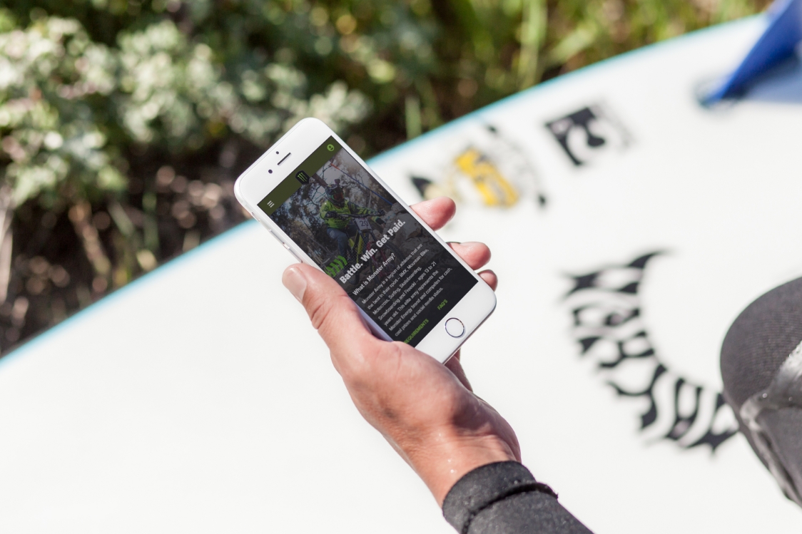
Most athletes used the app at events: outdoors, under glare, wearing gear, under time pressure. The interface was built for a desk, not a skate park.
Design Challenge
How do you rebuild athlete trust through product design when the trust gap is both operational (slow payouts) and experiential (confusing UX) , and you can't change the payout operations?
Discover. Define. Design. Validate.
I started with support ticket analysis and drop-off data, then ran contextual sessions with 8 athletes across 3 sports , observing how they used the app in the field: parking lots, event venues, training facilities.
Key Insight
Athletes interact with this app in 3 contexts: pre-event prep, live-at-event, and post-event admin. The existing design treated all three identically. Most confusion happened at post-event admin , the moments when athletes needed to claim prizes and submit results. That's where the redesign had to win.
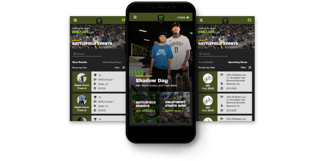
Surface what matters, now.
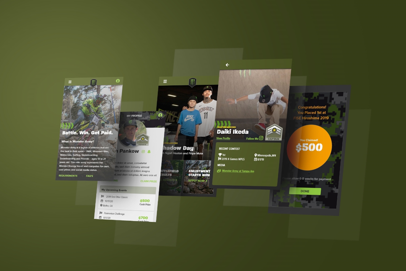
The home feed was redesigned around urgency. Battlefield event results, upcoming races, and prize totals were surfaced first. Athletes shouldn't have to search for a reason to open the app.
Live Battlefield Events Feed
Real-time race results and upcoming events ranked by prize value. Athletes see what's at stake before they even open a screen.
$967,125 Live Prize Counter
A persistent prize total created ambient urgency , a daily reminder of what competing was worth.
Outcome
Enlistment entry points embedded in the feed drove new signups organically from within the existing user base , no separate marketing push needed.
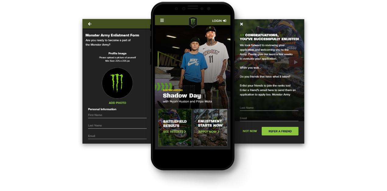
Form Optimization
The original sign-up form asked for everything upfront. I reduced it to the minimum viable set , name, sport, photo, submit , and moved everything else to post-acceptance profile completion. A completed signup converts; a half-finished one disappears.
Minimum viable enlistment
4 fields. Under 2 minutes. Completion rate was the metric that mattered most at the top of the funnel.
Referral loop at confirmation
Post-submission confirmation immediately prompts athletes to refer friends , turning every signup into a growth event.
Feed-embedded CTA
"Enlistment Starts Now" lived inside the battlefield feed , discovery through context, not a separate marketing page.
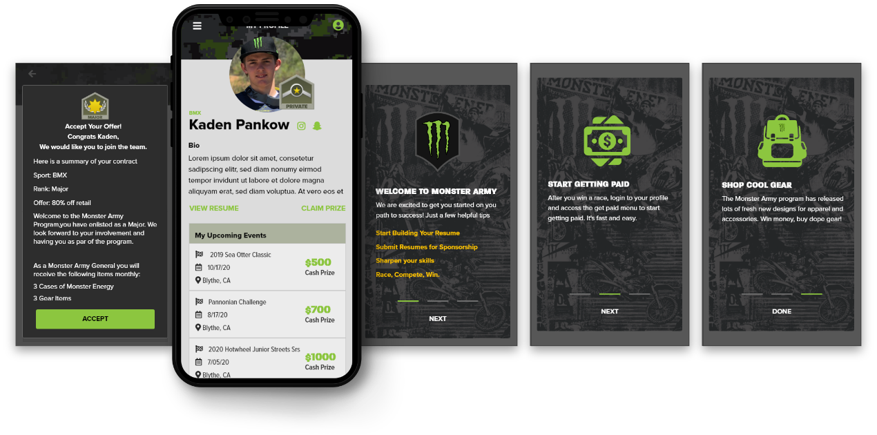
Clear next steps from day one.
Accepted athletes had no clear path forward. The redesigned onboarding sequence surfaced three core actions , build your resume, get paid, shop gear , immediately after offer acceptance.
One-tap offer acceptance
Contract details , rank, sport, offer %, monthly allotments , surfaced clearly. No ambiguity, no email follow-up needed.
3-card welcome sequence
Each card surfaced one primary action. Not an overwhelming list of features , three clear starting points and nothing else.
Result: 3× faster time-to-first-event
Athletes went from acceptance to competing within 72 hours, vs. a previous 3-week average.
Replace anxiety with visibility.
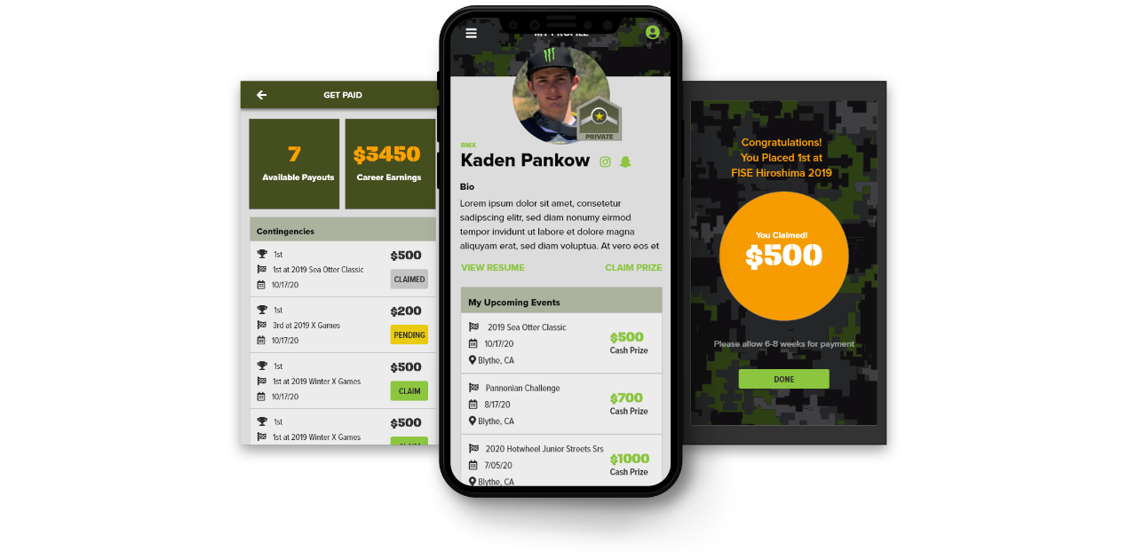
The biggest trust problem wasn't just payout speed , it was the silence. Athletes didn't know what was pending, claimed, or earned. The redesign replaced email chaos with a real-time earnings dashboard.
Real-time earnings dashboard
Available payouts, career earnings, and per-event claim status at a glance. Transparency as a trust mechanism.
One-tap claim
Originally 3 confirmation steps. Reduced to a single tap with immediate confirmation state , validated through two rounds of usability testing.
Prize celebration state
Full-screen win confirmation , brand-consistent, visceral, shareable. Made Monster feel like it was celebrating with the athlete, not just processing a transaction.
Validate
Tested high-fidelity prototypes with 6 athletes over 2 rounds. Key iterations: the claim flow was reduced from 3 confirmation steps to 1 based on usability observation. The enlistment form was cut from 12 fields to 4 after watching athletes abandon mid-flow. Both changes were driven by behavior, not assumption.
Constraints & Tradeoffs
What I worked within , and what I consciously gave up.
Design Constraints
Field-use mobile environment
Athletes use this app at race venues, training parks, and staging areas , outdoors, one hand, gear on. Every critical interaction had to be completable in under 3 taps.
Monster brand system lock-in
The visual identity , claw green, dark backgrounds, aggressive type , was non-negotiable. Every layout decision had to work within a tightly defined brand design system.
Legal compliance embedded in UI
Athlete contracts, offer acceptance, and prize claims all had legal requirements that had to live in-product , not offloaded to email. This required close collaboration with legal and constrained the offer acceptance flow significantly.
Global audience, ages 13–21
Athletes across 45 countries, middle schoolers to young adults. Copy had to be plain, actions self-evident, and the experience resilient to low-connectivity environments.
Design Tradeoffs
Speed vs. profile completeness
Chose: Speed
Reducing enlistment from 12 fields to 4 improved completion rate but meant managers had to collect remaining info post-signup. A completed signup converts , a half-finished one disappears.
Rich animation vs. performance
Chose: Performance
Removed complex micro-animations from the home feed in favor of static transitions. Event cards load faster and the feed feels snappier in low-connectivity race environments where athletes actually use it.
Feature depth vs. time-to-value
Chose: Trust first
Deprioritized social and community features entirely in favor of the Get Paid flow. The trust problem was financial , fixing financial visibility had to come before community building.
Custom patterns vs. native patterns
Chose: Native
Used platform-native UI components instead of custom controls. Slightly less branded but dramatically more learnable for a young, global user base encountering the app for the first time.
MISSION
ACCOMPLISHED.
92%
Prize claim rate
35%
YoY signup growth
72h
Avg. payout time
3×
Faster time-to-first-event
"The new system didn't just change how we track athletes , it changed how we communicate with them. It's built for speed, just like us."
Marcus Thorne
Global Director of Sports Marketing, Monster Energy
What I Learned
Trust is a product problem
I couldn't fix the payout timeline , that was ops. But I could make the uncertainty visible. Adding status transparency to the claim flow reduced anxiety even when the payout speed didn't change. Visibility is a form of trust.
Design for the environment, not the persona
"13–21 action sports athlete" is too broad to design for. Designing for the specific context , outdoor, at-event, high pressure, one hand , was far more useful than demographic assumptions. Where you use something shapes how you use it.
Legal constraints can improve UX
Embedding contract acceptance into the onboarding flow required close collaboration with legal. The constraint forced clearer copy and a simpler flow. The most constrained part of the product ended up being one of the most polished.
Validate your assumptions about "fast"
I assumed athletes wanted a fast onboarding flow. What they actually wanted was a fast path to competing. Onboarding length mattered less than clarity about what came next. The assumption was adjacent to the insight , but not the same thing.